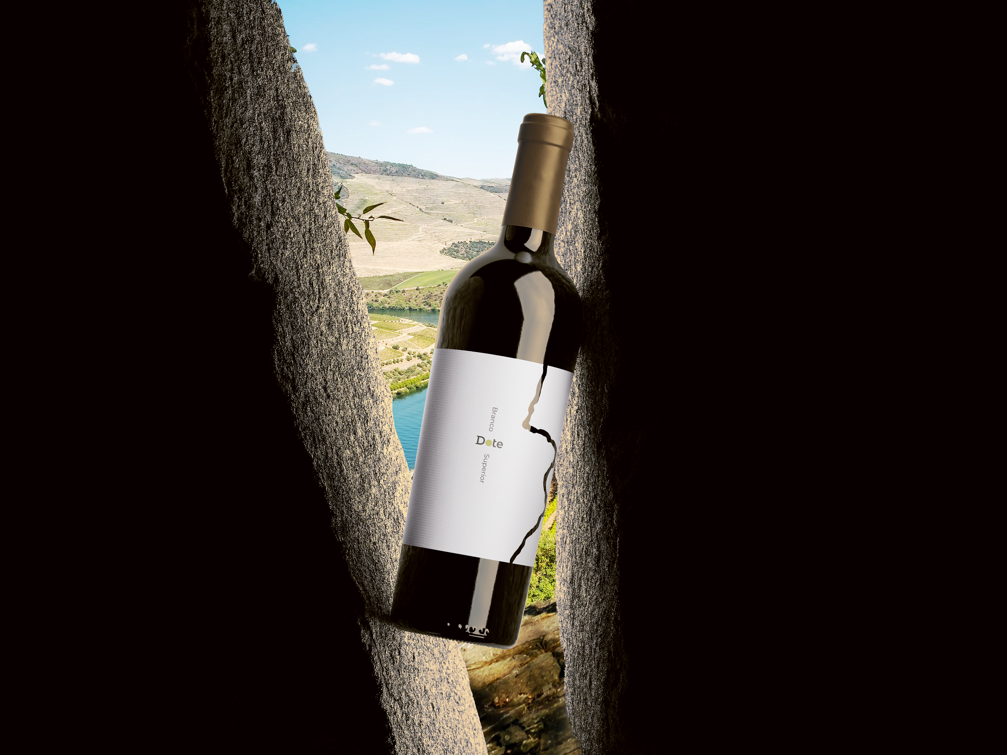
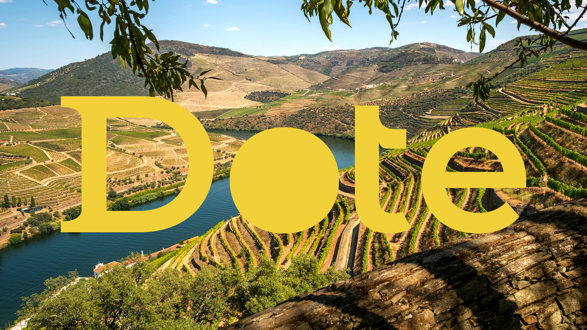
Surrounded by the breathtaking landscape of Portugal's Douro Valley, centuries-old vineyards produce some of the world's finest wines. In such a competitive market, strong branding is essential to help a bottle stand out on both retail shelves and dining tables.
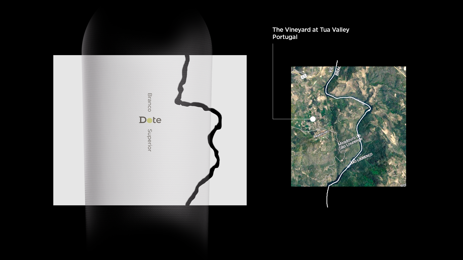
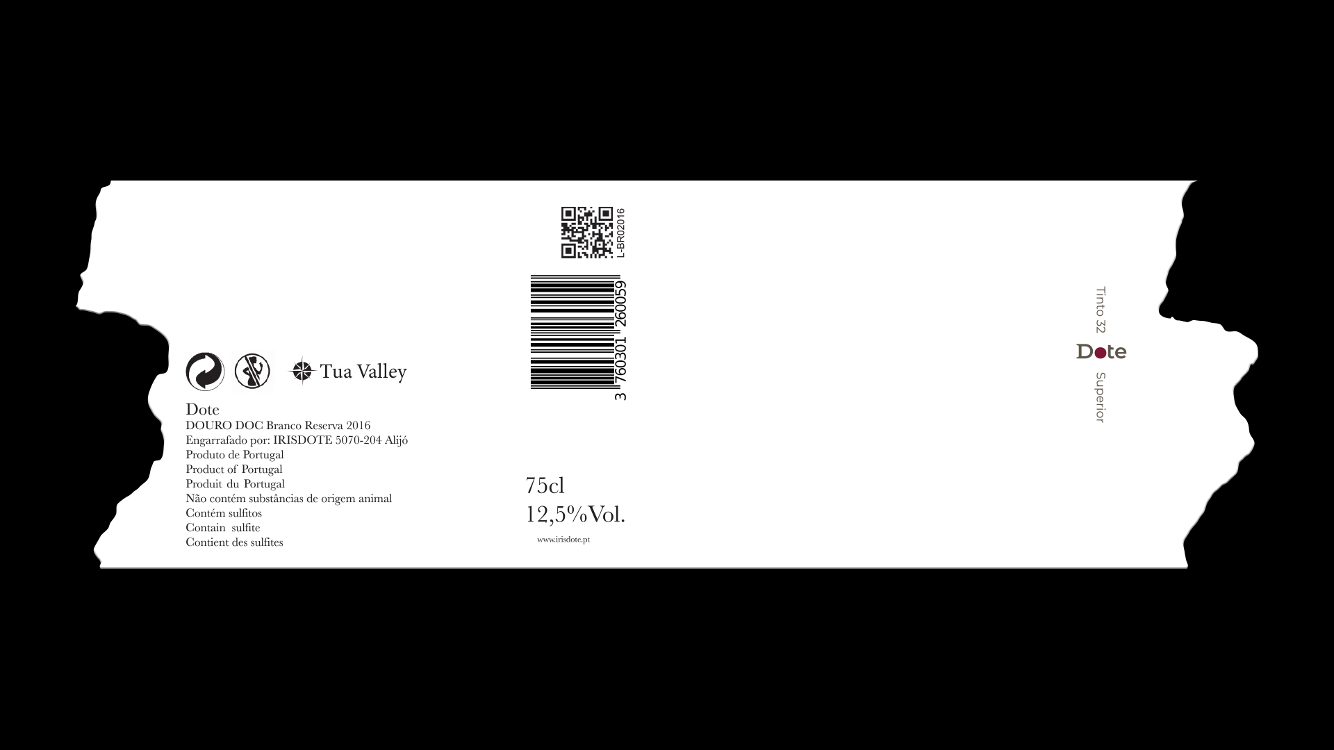
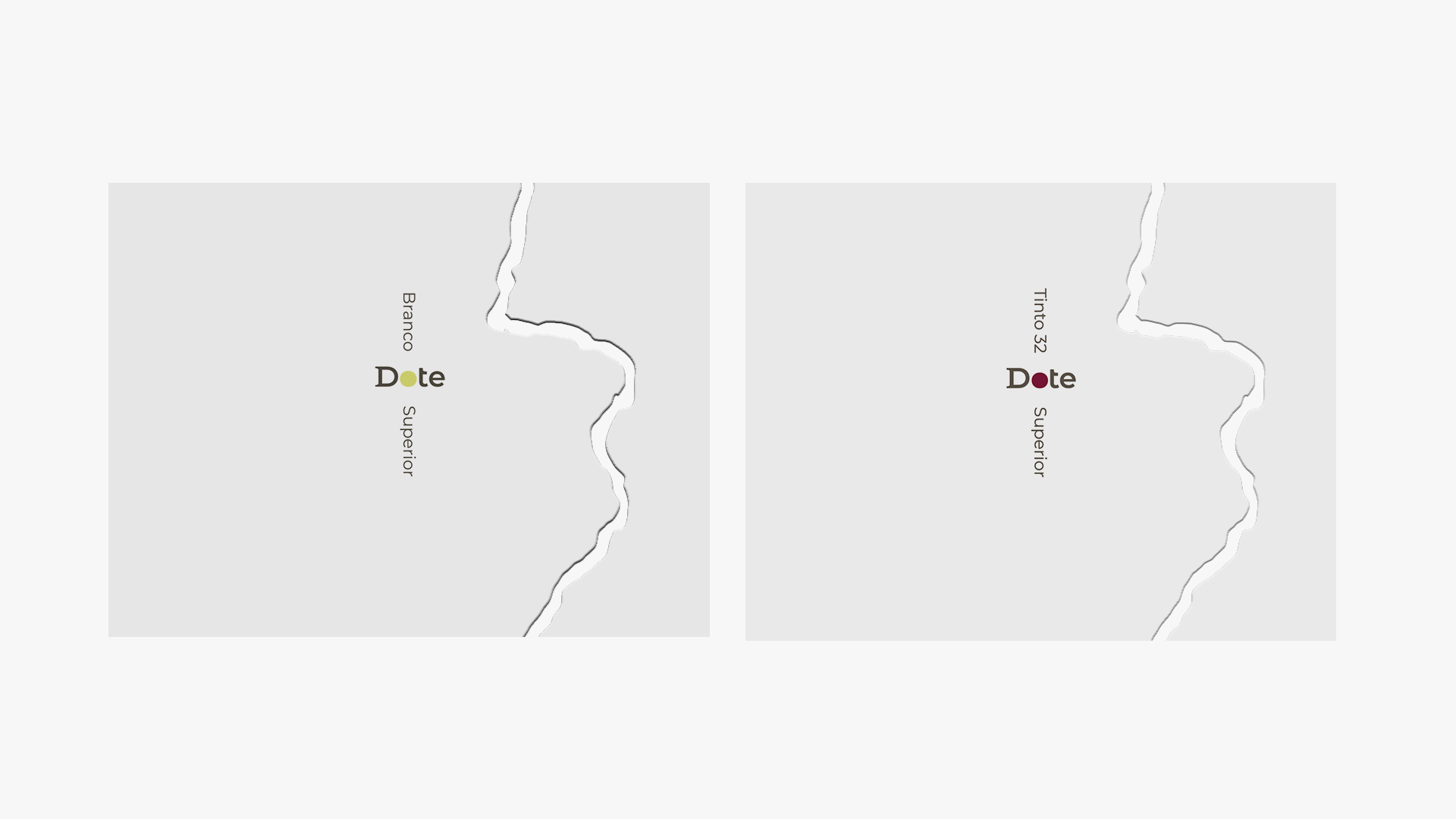
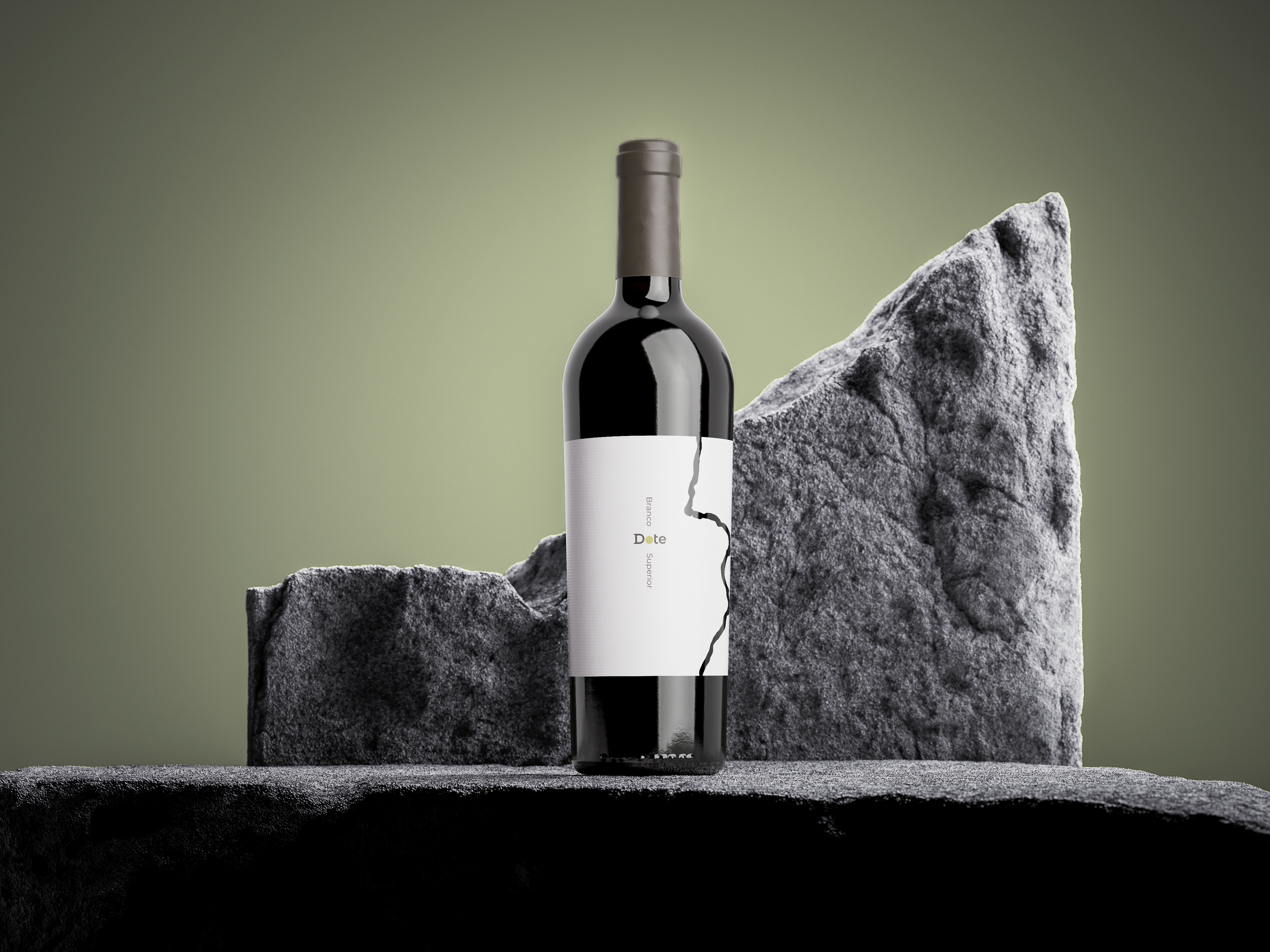
Dote—the Portuguese word for gift, talent, or dowry—is a premium wine produced in a small, exclusive batch. The identity was inspired by both the surrounding landscape and the winding course of the River Tua. The label wraps around the bottle with a custom die-cut that echoes the river's distinctive shape, while the logo marks the location of the vineyard along its banks.
The "O" in the logotype changes colour to distinguish each wine variety, creating a flexible yet cohesive visual system. A clean, refined aesthetic reflects the quality of the wine within, resulting in a distinctive identity that is elegant, memorable, and unmistakably rooted in its place of origin.